Drywall and Paint Let it Begin

In the new Kitchen

In the new Kitchen

As soon as insulation was inspected and passed we started drywall immediately and the installers were flying! They literally put up the drywall in 2 days! I have put up drywall before and it is one of those trades if you did not do it every day you need to practice, practice, and then practice some more. I could not be happier to see the home getting into the final stages. Once drywall goes up you are literally in the home stretch and now all the fun begins with the design items. I will have blog posts coming up soon to show the progress since we are moving fast.

Throughout the home is 1/2” drywall and we made sure to put the purple board in all bathrooms to deal with the humidity when taking showers. Always remember to put up either the green or purple drywall to make sure you protect yourself from any mold.

Kitchen Area

Kitchen Area

Looking from the kitchen through the dining area into mud room area.

Looking from the kitchen through the dining area into mud room area.

Living Room and front entrance

Living Room and front entrance

Hallway going toward bedrooms

Hallway going toward bedrooms

You will notice in these pictures that a large area and the hallway is painted in the color Wrought Iron by Benjamin Moore . I painted a dark color because this is the area all of the reclaimed wood by Stikwood. I have used this product in so many builds and it will give us the rustic feel we want throughout the home. This is done because when the wood panels come they are real wood and have imperfections. That means there will be knots that allow you to see the wall behind the wood. With this dark color up on the wall when we put up the wood it will blend in with knots and you will not see any white walls behind the wood. It is very important to do this or when you are finished installing the Stikwood you will need to go back with a dark marker and fill in the knots.

Hallway near bedrooms

Hallway near bedrooms

Living Room main wall

Living Room main wall

One of the Master Closets

One of the Master Closets

Skylights

Skylights

The Velux skylights bring in so much extra light into the home and since they can open and bring in fresh air it allows the home to breath. I cannot wait to show you them with the blinds on and how they work with Alexa.

Mud Job Complete

Mud Job Complete

We are almost ready for tile

We are almost ready for tile

The house is now primed and ready for paint as well. For primer I used Benjamin Moore Fresh Start 046 White. This primer is excellent and since I had some old drywall that I kept with the new drywall it blended everything perfectly. All the walls now look uniform and are ready for the first coat of paint. The primer is so important to get your walls ready and you have to make sure you are putting on enough. The last thing we did was paint all the ceilings so we do not have to worry about that anymore. For ceiling paint we used Benjamin Moore Ceiling paint Ultra Flat color White Hero-OC-57. The ceilings are now a crisp white and you can start to see the home come to life!

Fresh Start Primer

Fresh Start Primer

Ceiling Paint

Ceiling Paint


Rough Inspections Passed

Lily in her room before the insulation went in.

Lily in her room before the insulation went in.

One of the biggest moments you will have during your renovation process is when you pass rough inspections. It is the greatest feeling because that means it is a race to the finish and all the finish work can begin! I have been waiting for this moment for the past 2 months and it is finally here. We have been moving at a good pace and I am very happy with the progress that we have made thus far.

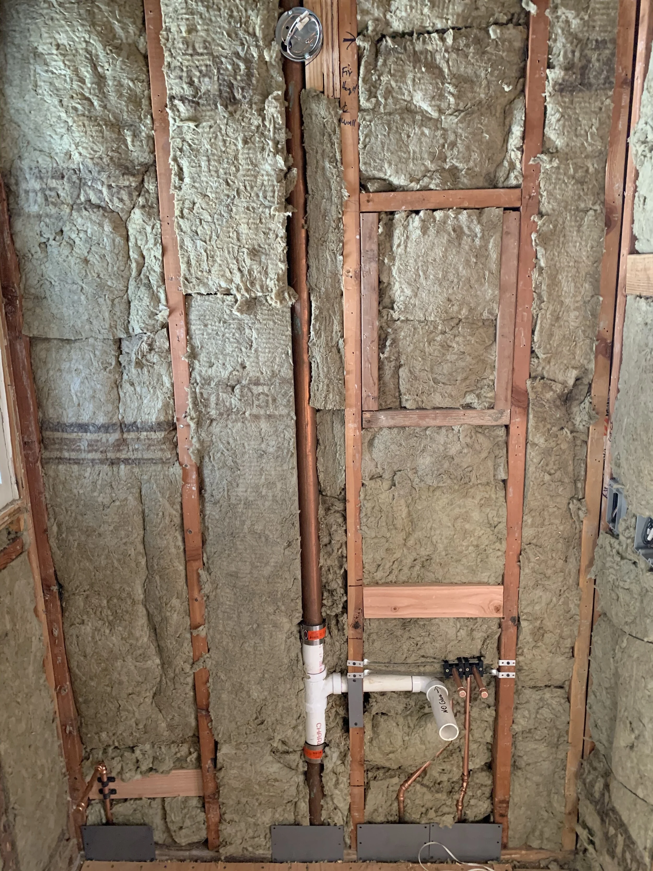
You must remember to document the rough work and keep a ton of pictures of where all your new plumbing and electrical wires are inside the walls. If you ever need to reference the pictures and find something you will be able to easily. Make sure you have pictures of all the walls when it is framed, rough out with mechanicals, and then insulation. If there ever comes a time when you have to open the walls you will be able to find what you are looking for very easily.

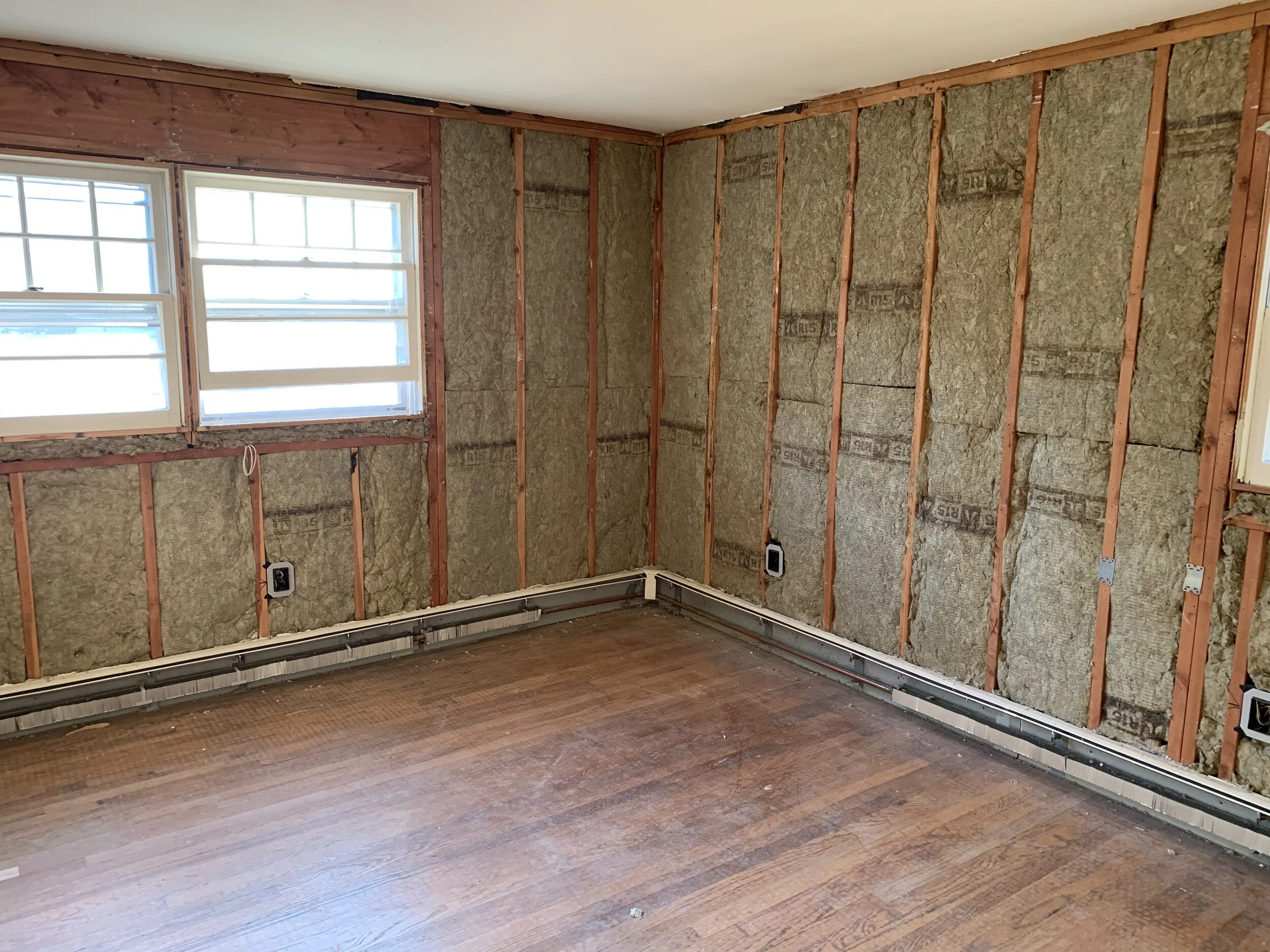
For insulation in my home I used Rockwool. This is more expensive then your normal batt insulation, but the benefits it gives your home is something that I could not pass up. I wanted to make sure that I had the proper insulation inside the home so my heating and cooling was at it’s maximum potential. I went with 3 different types of Rockwool inside the home., R-15 for the walls, R-30 for the ceiling, and Safe and Sound for internal walls between rooms.

R-15

R-15

R-30

R-30

Safe and Sound

Safe and Sound

The great benefits of this type of insulation is that it is fire resistant, sound absorbent, and water repellent. Those are the 3 most important things you need for insulation and most batt insulation does not have any of these attributes. Now when I walk through the home the sound is gone and the echo is almost completely gone. Since I had a good amount of the sound insulation I also put it in all of the bathrooms. We will not hear the showers running, or TV’s from bedroom to bedroom. Most of the the time insulation is only used on the exterior walls, basements, attics, and crawl spaces. From the pictures below you will see I used insulation between all walls!!

Jenn living her best life :)

Jenn living her best life :)

As soon as we passed our rough inspections we started insulation and we finished in one day! We are not messing around and we are moving fast!

Kitchen area with the Sound insulation so we will not hear anything inside the living room.

Kitchen area with the Sound insulation so we will not hear anything inside the living room.

Living Room Wall

Living Room Wall

Back Exterior wall with R-15

Back Exterior wall with R-15

Mudroom/Sunroom with R-30 and R15. This room has a ton of windows and doors.

Mudroom/Sunroom with R-30 and R15. This room has a ton of windows and doors.

Velux Skylights are insulated with R-30 around them.

Velux Skylights are insulated with R-30 around them.

Inside the home I am having all new windows and doors installed with Renewal by Andersen. This is going to also increase the “R” value of the entire home. When the doors and windows are installed this is going to increase the sound resistance even better then it is now. I will be showing everyone the entire process of the window/door process as soon as they are ready to be installed.

Living room wall with R-15 and the huge bay window that will be changed out to a Renewal by Andersen Bay Window.

Living room wall with R-15 and the huge bay window that will be changed out to a Renewal by Andersen Bay Window.

Master Bedroom with R-15

Master Bedroom with R-15

Lily’s room with R-15

Lily’s room with R-15

Lily’s bathroom exterior wall with R-15

Lily’s bathroom exterior wall with R-15

Master bath shower is insulated with sound insulation and shower liner is in. My plumber Orlando did a great job with this.

Master bath shower is insulated with sound insulation and shower liner is in. My plumber Orlando did a great job with this.


Dress Your Kitchen

The number one question I always get when I am traveling the country is what countertops should I install in my kitchen? There are so many choices that it becomes confusing. I have literally installed them all from natural stones to quartz materials. A material that has been around forever, but has not received a lot of headlines is porcelain. The company I am working with for my home is SapienStone. They are a European company with over 50 years experience in the ceramics serving more than 100 countries. Their USA manufacturing facility is based in the Smokey Mountains of Tennessee with a 700,000 sq.ft. manufacturing facility.

SapienStone’s slabs are crafted from ceramic clays and mineral colorings. With its unique manufacturing process the slabs will not be altered by heat, light, chemical cleaners, and disinfectant products. There is zero maintenance and you can rest assured knowing that the product will look and function the same for its entire life. The product can also be used in bathrooms and outside.

Some of you might be asking what is the difference between Porcelain and a Quartz material? The largest difference is that the SapienStone product is light resitent and can be used outside. That means if you have an outdoor kitchen this product can deal with the hot and cold seasons along with direct sunlight.

From an aesthetic point of view there is no product that looks as intriguing and exactly like a marble product. If you took a natural Calacatta marble and put it side by side with SapienStone product you would not know which was the porcelain product. I have used the product before for many other clients and it continues to blow me away with its characteristics and overall design.

I love natural stones like marble and granite, but they are a lot of maintenance. Once I install something I do not want to have to worry about it anymore and that is what SapienStone does for me. We all live very busy lives and to constantly be thinking about sealing my counters, bathroom tile, and stains from over-use is something that I do not want to have to worry about.

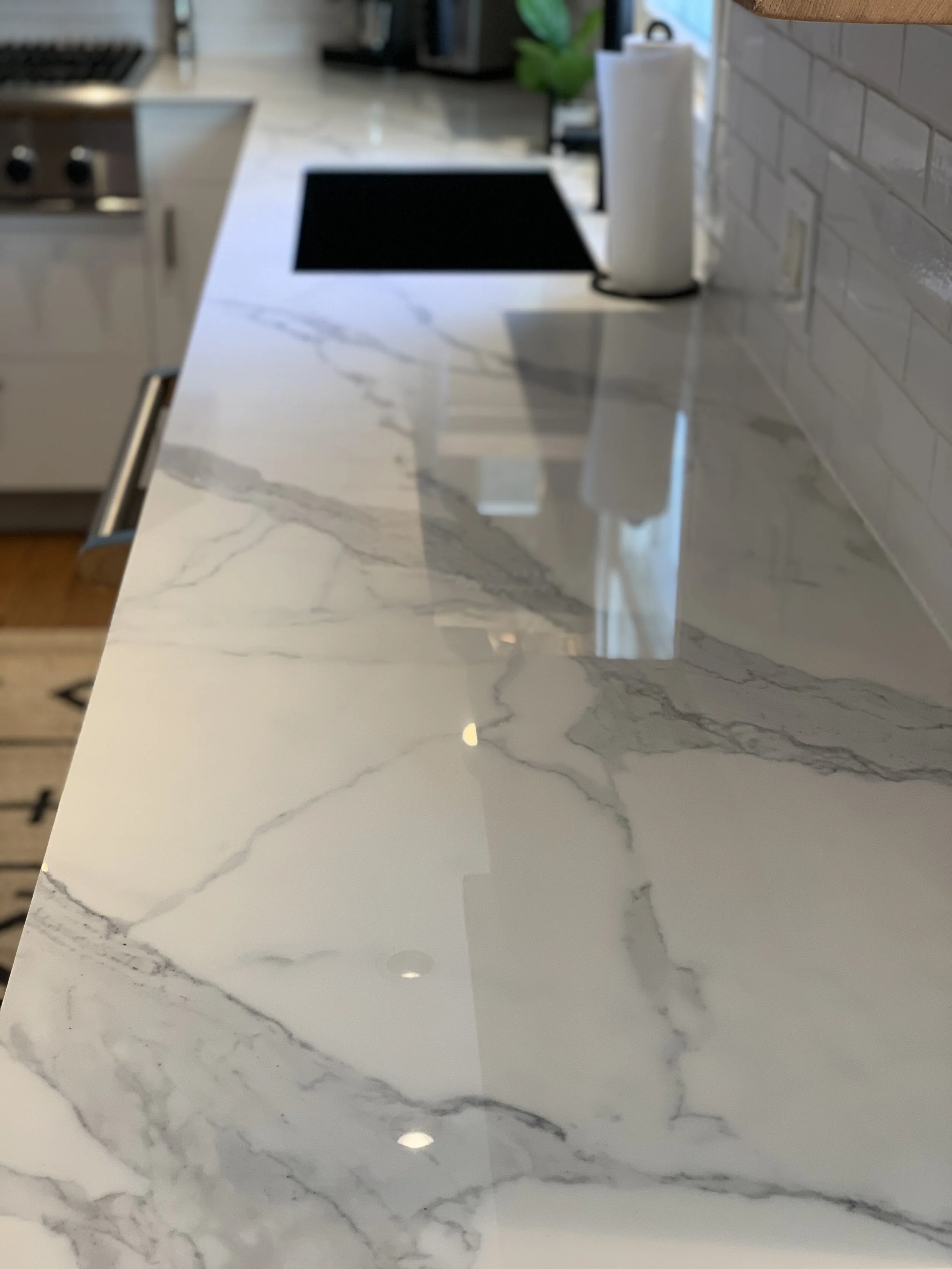
Calacatta Light in kitchen remodel

Calacatta Light in kitchen remodel

Calacatta Light material

Calacatta Light material

Calacatta Light material

Calacatta Light material

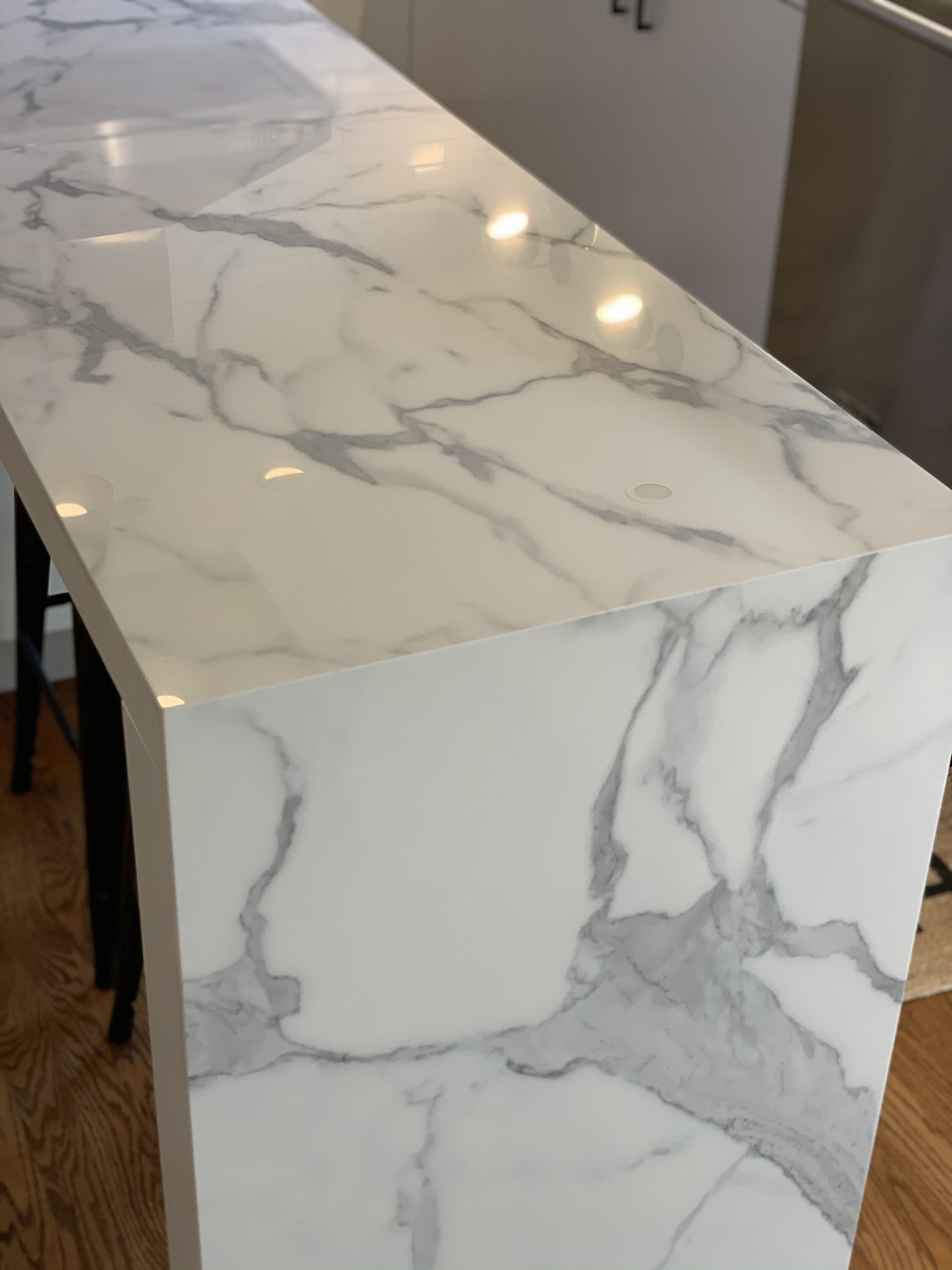
Calacatta Light material with a waterfall style for the island

Calacatta Light material with a waterfall style for the island

The pictures above are from a recent kitchen that I just finished for a client. They wanted to have marble, but have 2 kids and needed to have something with no maintenance. When I took them to the showroom they freaked out and fell in love with the Calacatta Light material. I knew this product was going to make big impact in the kitchen and my clients could not be happier with the results. To see more pics of this kitchen go to the Design tab on my website and you will see them there.

For my home Jenn and I wanted to use 2 different types of material in the kitchen area. The island is the main focal point and HUGE. We decided on using Calacatta White in gloss, which has very large gray veining in the material. With the size of the island (10’6”) the veining will be prominent and really stand out. We also have 4ft. sink with a commercial style faucet by Elkay. With seating for 5 people the island is going to be a place where everyone gathers around and will get the most use in the inside the kitchen.


Calacatta White

Calacatta White

Calcatta White

Calcatta White

The “L” section of the counter is going to be something that is polar opposite and will look much more contemporary in nature. It is called Grey Earth and looks like a concrete material mixed with stone. With the backsplash from Walker Zanger and the black island cabinets this is a material that makes a big statement inside the kitchen. I like having a little of the “old world” Calacatta and then something contemporary like this. The picture below shows the material with our hexagon backsplash and black island color. Make sure you read the kitchen blog so you see all the details about the ktichen.

Grey Earth

Grey Earth

Grey Earth

Grey Earth

Next is the bathrooms and for the girls bathroom we went with Light Earth that will be used around the 24” vanity. Since the girls bathroom has the pink and white triangles this grey will balance out the bathroom and give it element of a stone that is contemporary. This is a lighter version of the Grey Earth that we chose for the kitchen.

Light Earth

Light Earth

Light Earth

Light Earth

The last is our master bath and we are doing something very special with the material we chose. We chose Bianco Lasa for the sink area. Our vanity is 48” and we are going to have one large trough sink that is going to be made out of the Bianca Lasa. Since the porcelain material will never change with direct water constantly running over it, this is going to give a very unique look to our bathroom. We cannot wait for this install to happen and will be the 1st time I am attempting this! YIKES!. I have aways wanted to have the counter material made for the sink, but I could not find the right material. I know this will be a show stopper in the bathroom especially with black faucets that will be mounted on it.

My installer from Faithful Countertops is the leading installer in our area and will make our visions come to life. I will be detailing more of their work as we get closer to the templating and install process. I will be taking you over to their offices and warehouse in Paterson, NJ so you can see how counters are laser cut. It is a really cool process!

Bianco Lasa

Bianco Lasa

Bianco Lasa

Bianco Lasa

This is an example of the counter and sink all in one. Since it will be a trough drain it will span the entire vanity which is 48”.

This is an example of the counter and sink all in one. Since it will be a trough drain it will span the entire vanity which is 48”.


Bringing Tile Back

Searching for tile can be very overwhelming since there are literally thousands of options to choose from. I have a couple favorite companies and Walker Zanger was the top choice for our home. The choices and style options are for every design style. Jenn and I wanted to make sure we found tile that was unique, but also maintenance free in the bathrooms and high traffic areas. We took a drive to the Port Chester, NY location to see the showroom and decide on what we wanted. Lisa Cales, the Branch Manager, took us through all their new styles to see what we would like.

Port Chester, NY Showroom

Port Chester, NY Showroom

The First area we started with was the mudroom area. This area is the second entrance into the home from the front of the house and the garage. It also has rear sliding door going out to the backyard. It is a room that is going to get a ton of use since as a family we will always be coming in from the garage. It will also have a custom built-in-cubby for shoes and coats. We knew we had to go with a porcelain tile that was maintenance free and easy to clean. We wanted to find a tile that was more on the contemporary side. Lisa showed us a couple options and we chose Stark Grigio in a 12x24 size. This tile will be laid in a brick style pattern throughout the entire room. The tile looks a lot like a concrete or natural slate. This will look great and will also have a heated floor mat underneath it.

Stark Grigio 12x24

Stark Grigio 12x24

The next area is the entry way and this had to be very unique since it is the first thing you will see when you enter the home. Jenn and I knew that we wanted to make this a patterned tile and have it bleed into the living room and hallway. Now you are saying what do I mean by bleed into these areas? The tile will not have an exact finish line and it will be done in a very haphazard way. I have done this before on my show America’s Most Desperate Kitchens and it was one my favorite designs. The hexagon tile bleeds into the living room from the kitchen and there are 3 different colors.


America’s Most Desperate Kitchens

America’s Most Desperate Kitchens

America’s Most Desperate Kitchens

America’s Most Desperate Kitchens

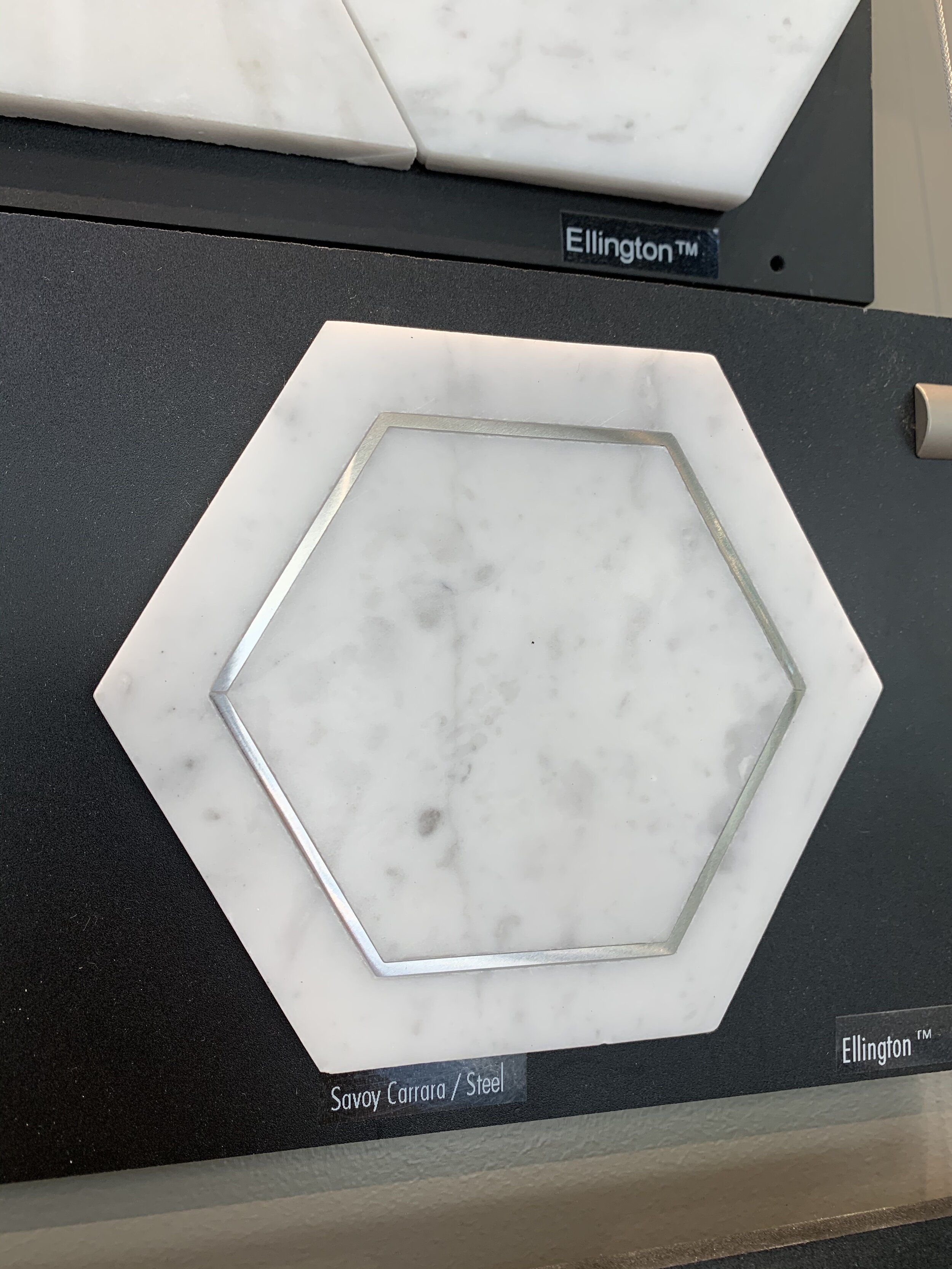
We chose 3 different hexagon tiles that are a marble but, smaller hexagon then what you see in the images above. We chose a Black, Gray, and our favorite Carrara with inlay steel! These three tile options will be laid with no exact pattern and be mixed throughout the font entrance area. The colors are Ellington Ebony, Ellington Cinder, Ellington Savoy Carrara Steel.

Ellington Ebony

Ellington Ebony

Ellington Cinder

Ellington Cinder

Ellington Savoy Carrara Steel

Ellington Savoy Carrara Steel

The kitchen backsplash is always a statement area of the kitchen. We wanted to continue the look of the hexagon pattern and give it a contemporary look for the kitchen. This tile will go form the counter to the ceiling behind the hood since there are no upper cabinets and four open shelves. We finally decided on Stardust Moon Rock. It gives us the contemporary look with the hexagon, but the tile is also distressed and has a crackle look to it. This will gives us a little of the old world feel and rustic look that we also have inside the home.

Moon Rock Hexagon

Moon Rock Hexagon

Now it’s time for the bathrooms! Let’s start with the girls bathroom since this is my favorite tile in the entire home. Lily has been telling me she wants to have color in her bathroom and when I saw this tile I knew this was it. You might not fully understand my vision, but trust me this is going to look AMAZING! A brand new tile that Walker Zanger just came out is called Kaleidoscope. This Art Deco look is a collection of triangle and square porcelain tiles in fun matte colors. The patterns you can create with them are endless and give you the opportunity to make your bathroom unique. I first saw the dark pink and then the light pink triangles and fell in LOVE. Lily loves pink and I feel it is a play on the old school pink tile that was in so many 1960’s Ranch home bathrooms. With the triangle design it gives it the contemporary design that we love and is throughout the home. We also chose a white triangle to anchor the pink choices. The unique design is going to come with the install of the tile. The install is going to be an ombre effect with the dark pink first and then slowly it will turn into light pink and then to white. See an example below that was done in a herringbone install.

This is an example of the ombre effect with the herringbone tile.

This is an example of the ombre effect with the herringbone tile.

Kaleidoscope the three choices are Dark Pink, White, and Light Pink

Kaleidoscope the three choices are Dark Pink, White, and Light Pink

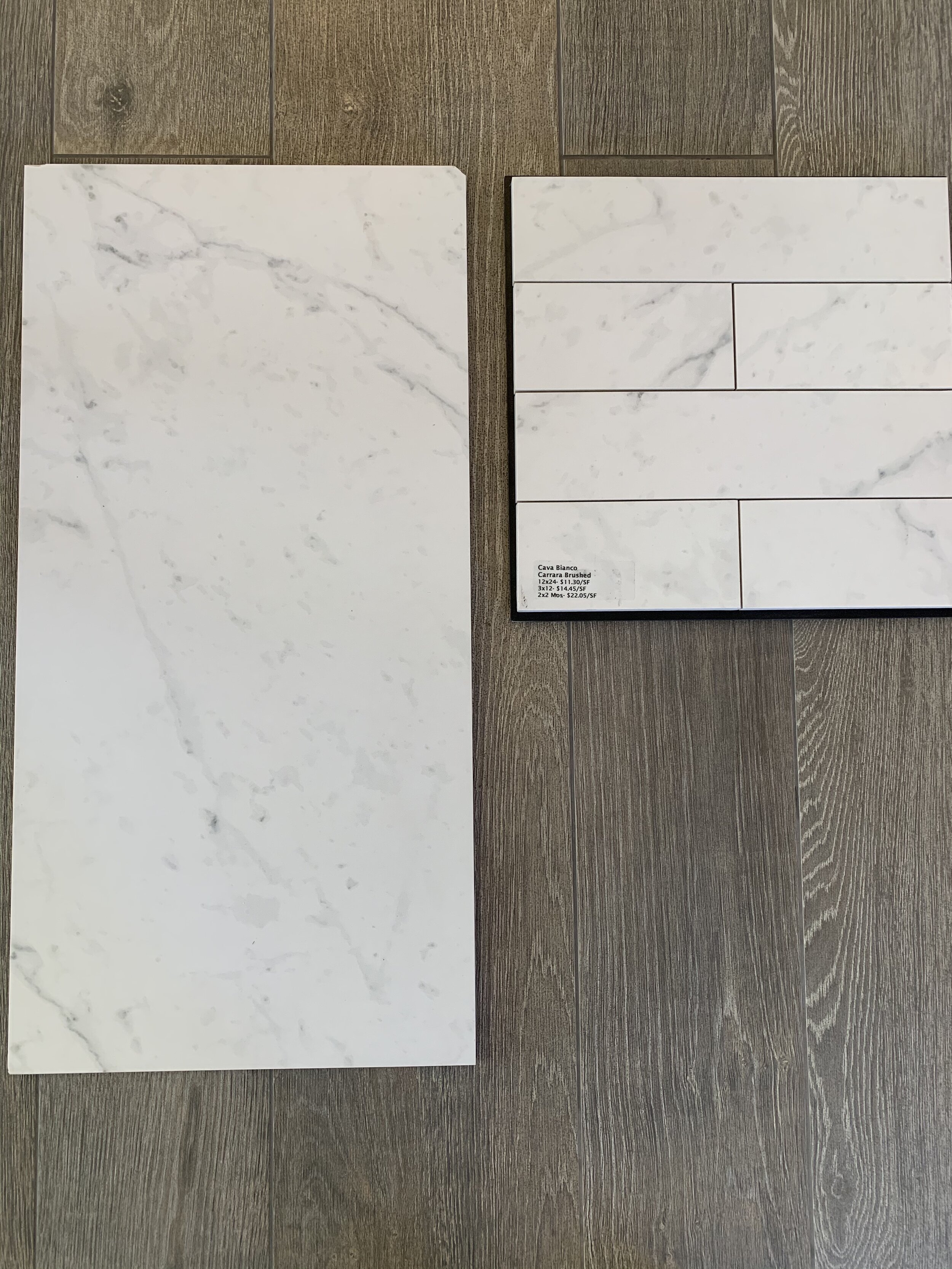
The master bath is an area that Jenn knew exactly what she wanted! Since we did our last home she said she wanted a Carrara marble tile for the entire bathroom. Now I have nothing against Carrara marble I also love the look, but it is the maintenance. Marble like all natural stones is porous and needs to be sealed constantly. We had to find an option that gave Jenn the look she wanted, but the maintenance that I wanted. Lisa showed us the porcelain option that Walker Zanger makes of the Carrara marble and it looked exactly like marble. I could not believe it! The price point is much cheaper and there is no maintenance at all. We decided to do the walls in 12x24 Cava Bianco Carrara Brushed. This is a mat look and it makes it look much more like a natural stone that is honed. For the floor in the shower and overall bathroom we went with Cava Bianco Carrara 3x12 Brushed. For the floors we also decided to do them in a herringbone pattern to give it a more traditional look.

Cava Bianco Carrara Brushed

Cava Bianco Carrara Brushed

We could not be happier with all of our choices from Walker Zanger and before you know it we will be time for the install. Lisa, the Branch manager, was amazing and answered all of our questions throughout the day. We were in the showroom for a couple hours and we had so much fun choosing all of the finishes. Before you go to the showroom make sure you bring your plans and you have an idea of what you are looking for. The sales team will lead you in the right direction, but you need to have an idea of what you are looking for. There are literally thousands of choices so you need to be prepared before you go.

Myself and Lisa Cales the Branch Manager

Myself and Lisa Cales the Branch Manager


Kitchen Design Time :)

It has come time to start the design process of the KITCHEN! This is one of the most anticipated rooms in the home and the central hub where everything stems from. Jenn and I have been going back and forth on so many design elements inside the kitchen. The one thing she told me from the start of this project is that the kitchen was going to be different from our last kitchen and she would make most of the choices. LOL! Over the years she has seen so much of my work she knew what she wanted to do in this space and that it would be custom to what she likes. Yes that means I have to compromise! Since we have taken down so many walls in the main area of the home the kitchen really is part of the dining room, living room, and mud-room area. All of these spaces need to be cohesive and blend together. I am doing that with paint colors and lighting.

I came up with a “L” kitchen design and a MASSIVE 10’6” island that would flow right into the dining area so it makes it feel like one large room. The first stop to plan everything out was to visit my buddy Bob Amberg of Certified Kitchens. Bob has over 20 years experience and an incredible showroom that would allow us to choose the perfect cabinets for our space. We had an overall idea of what we wanted, but needed to see a couple different cabinet ideas to bring the entire design together. One of the main design elements is going to be the island and we already knew the paint color we wanted which is Benjamin Moore 2124-10 Wrought Iron. This color would start the design process for us and everything else would stem from that. I always like to find one element that will start my design process and build from there. This color is also going on all the trim and doors inside the home so everything will blend together. You will be able to follow this color throughout the home and see it used in many different ways.

The bottom color is Benjamin Moore 2124-10 Wrought Iron. This is a mixture of Black, Brown, and Gray.

The bottom color is Benjamin Moore 2124-10 Wrought Iron. This is a mixture of Black, Brown, and Gray.

When going to a showroom expect to be there for a couple hours. There is a lot to choose from! Also try and have your appliances, backsplash, lighting, and even cabinet hardware chosen. This will make the process go a lot smoother and quicker. I know this a lot to ask that is why it makes sense to hire a designer like myself to help you through the process and get these choices made before you step inside the showroom. For the cabinets Jenn and chose to go with Medallion Cabinetry. The cabinets are semi-custom and have incredible craftsmanship around every detail of the kitchen. We knew these cabinets had to be unique and Medallion was the one that could give us all the options we wanted. I lean more towards a modern kitchen and Jenn likes rustic so we had to have the right balance of both. I also wanted to bring in an element of industrial design as well that would really change things up! As soon as we were there we saw the exact stain we wanted for the “L” part of the kitchen. This part of the kitchen will be a Cherry wood, Bayside model, Peppercorn with a Ebony glaze highlight. The short side where the fridge is going will also have a shiplap backsplash in the Benjamin Moore Wrought Iron color.

Shiplap will be the backsplash in this part of the kitchen Wrought Iron.

Shiplap will be the backsplash in this part of the kitchen Wrought Iron.

Cherry cabinet with Peppercorn stain and Ebony glaze.

Cherry cabinet with Peppercorn stain and Ebony glaze.

All of the Medallion cabinets will be inlay doors and draws giving a much more custom look and more rustic feel to the kitchen. The cabinets next to the in-wall oven will have doors that fold back into it allowing us to store all of our plug-in appliances like a toaster, mixer, and coffee machine. I love this because they will be hidden when we want and open we are in the kitchen cooking. The corner area of the kitchen and next to fridge is the only area that will have upper cabinets. The main area where the hood and range are will have 4 open re-claimed shelves.


“L” view of the kitchen the long run is 194” and short run is 107”

“L” view of the kitchen the long run is 194” and short run is 107”

The 10’6” island goes into the dining room slightly blurring the lines of these two combined rooms.

The 10’6” island goes into the dining room slightly blurring the lines of these two combined rooms.

The kitchen, dining room, and mud-room area all combined into one space.

The kitchen, dining room, and mud-room area all combined into one space.

Below I have put the 2-D floor plan so you can see where everything is laid out inside the kitchen. The island has a 4’ft long workstation (sink) that is going to be a focal point. There is going to be a separate blog just about this since it is so unique! All the appliances in the kitchen are going to be from Monogram. In the island I have a 24” custom panel dishwasher, a 36” gas range with custom hood above, an in wall speed oven, 30” wall oven, and custom panel 36” French door fridge. The hood above the range will be the same shiplap as the backsplash on the 107” run of the kitchen. It will also be painted Wrought Iron. With the island, hood, and backsplash in the same color it will bring the kitchen together and make it very bold.

36” Pro Gas Range ZGP366NRSS

36” Pro Gas Range ZGP366NRSS

Built in speed oven Advantium ZSC2202JSS.

Built in speed oven Advantium ZSC2202JSS.

30” single Pro oven ZET1PHSS.

30” single Pro oven ZET1PHSS.

Integrated dishwasher ZDT985SINII.

Integrated dishwasher ZDT985SINII.

36” Built-In French Door Fridge ZIP360NH.

36” Built-In French Door Fridge ZIP360NH.

I am going to give a lot more details on the Monogram appliances in a separate blog showing their tech, cooking power, and beautiful lines.

The 3-D images of the kitchen give a great representation of what the layout will be and functionality of the space. Yes, I do have the kitchen triangle, but you do not always need that when designing a kitchen. My layout worked out like this and it happened to be the best configuration for the space.

Birds eye view of the Kitchen from Certified Kitchens.

Birds eye view of the Kitchen from Certified Kitchens.

3D “L” section of the kitchen.

3D “L” section of the kitchen.

Island with 4’ sink workstation.

Island with 4’ sink workstation.

The backsplash on the hood side of the wall with the floating re-claimed shelves is going to be from Walker Zanger, Stardust Moon Rock, in a Hexagon pattern. This will give the contemporary edge that I am looking for. This is very large section of the wall and it will be from the counter up to the ceiling. The tile has a crackle and gloss look to it so it will give a very custom feel to the kitchen.


Stardust Moon Rock from Walker Zanger.

Stardust Moon Rock from Walker Zanger.

The counter top is going to be two different materials by SapienStone. This is by far the best man made stone on the market and it looks exactly like marble when it is a porcelain. The island counter is going to be Calacatta white in a gloss finish. The “L” section is going to be Light Earth to give a cement design. By having the Calacatta we get a very old world feel and the Light Earth gives a industrial/modern feel to the kitchen. Both Jenn and I are getting a little of everything we want in this kitchen.

SapienStone Calacatta White

SapienStone Calacatta White

The Light Earth for the back section of the kitchen with the Moon Rock backsplash and Wrought Iron black color.

The Light Earth for the back section of the kitchen with the Moon Rock backsplash and Wrought Iron black color.

The final element to this design is one of my favorites! The lighting and hardware! This is the cherry on top of the kitchen and it is going to bring in the industrial elements along with some metal into the kitchen. Mixed metals inside a kitchen are very on trend right now even though I hate saying that. I think the look is timeless and very unique to our space so that is why we are going with these choices. I have chosen all of my lighting and hardware from Buster and Punch. The island will have 5 of the hooked small/stone/brass lights.

Small Hooked light with stone shade and brass finish.

Small Hooked light with stone shade and brass finish.

The back section above the shelves with will have four of the small caged light with black marble. Two lights will go above each shelf.


Small caged light with black marble.

Small caged light with black marble.

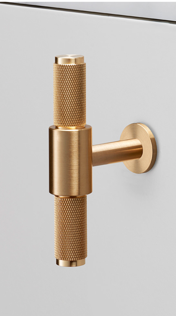
The Pulls are going to have two different types which are a Pull bar in black and T-Bar in brass. This hardware is a machined material that is going to make the cabinets really stand out!

Black Pull Bar

Black Pull Bar

Brass T-Bar

Brass T-Bar

There are are lot of very different design elements going into this kitchen, but it is also going to make it very unique in style. We have gone back and forth on a couple different items, but I think overall this is going to give the both of us the traditional-country-modern-industrial-kitchen we have always wanted!!! Say that 3 times LOL!


Let there be LIGHT

Adding natural light to a home can be tricky. You have to know where it makes sense and get the most out of it. I knew that by taking down walls I would be able to share the light with the front and rear, but I needed to do more. When I first walked through the home there was a breezeway/mud room that was portioned off from the rest of the home. It is around a 200 sq.ft. room that was just being wasted and not utilized like it should be. This room must have been separated from the home in the past since the garage is right next to it. It is also is a slab on grade and not part of the basement so that tells me it was added at a later date. The cool part about this section of the home is that it had a second front entrance/porch, a sliding rear door, and a skylight that pours a ton of light into the home.

The front door is behind me and shown here is the rear door and existing Velux skylight.

The front door is behind me and shown here is the rear door and existing Velux skylight.

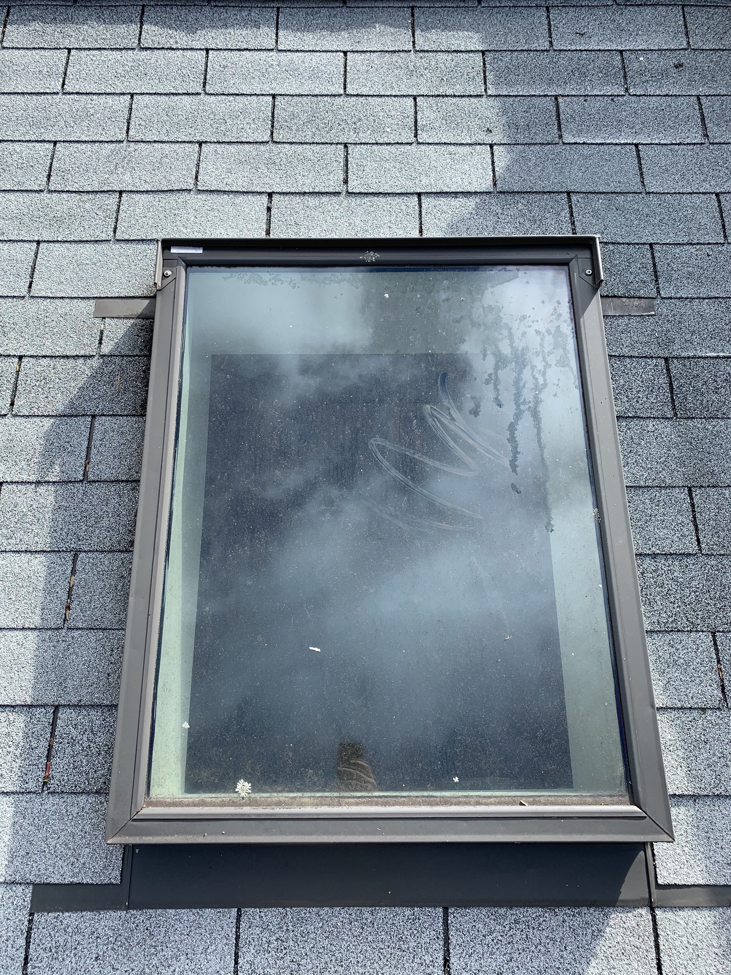
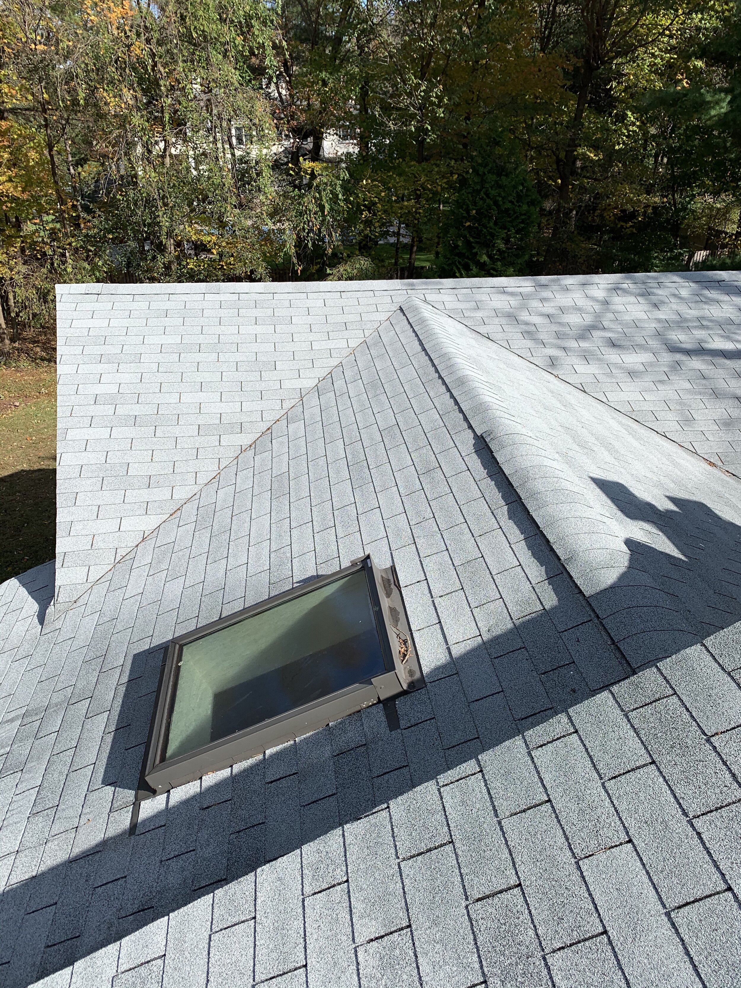
I had to share this light with rest of the home and there was only one way to do that. Take down the wall separating the mud room from the main house. To create even more light I decided to add a second skylight that would flood this area with a ton of natural light. Now I know what everyone is going to say “skylights leak and they can add more issues to the roof”. That could be the case if you go with an inferior manufacture of skylights. That is why when installing skylights I only choose VELUX. The existing skylight is an older Velux model that is 30 years old! The incredible thing is that even this older model has never leaked! There is no sign of water damage anywhere. First thing I need to do is take down the drywall and see what I am working with.

Existing 30 year Velux skylight.

Existing 30 year Velux skylight.

Existing Velux skylight and old roof.

Existing Velux skylight and old roof.

Drywall is down in the mudroom area.

Drywall is down in the mudroom area.

Now I can see all the framing underneath the skylight. I have 12’ ceilings in this area and with all the light pouring in it is going to be make a HUGE difference in the rest of the home. As I thought there is no water damage at all and the old skylight has done a great job over the years. The skylight is going to go directly adjacent to the existing skylight and will be located on the front pitch of the roof. Now as the sun comes over top of the home I will get sunlight from all angles that will be shared with the main living area of the home. Natural light always make a home feel larger than it really is that is why you want to be able to bring as much natural light into the home that you can. Next steps, it is time to start taking off the old roof.

Existing roof

Existing roof

Old Roof is on it’s way out!

Old Roof is on it’s way out!

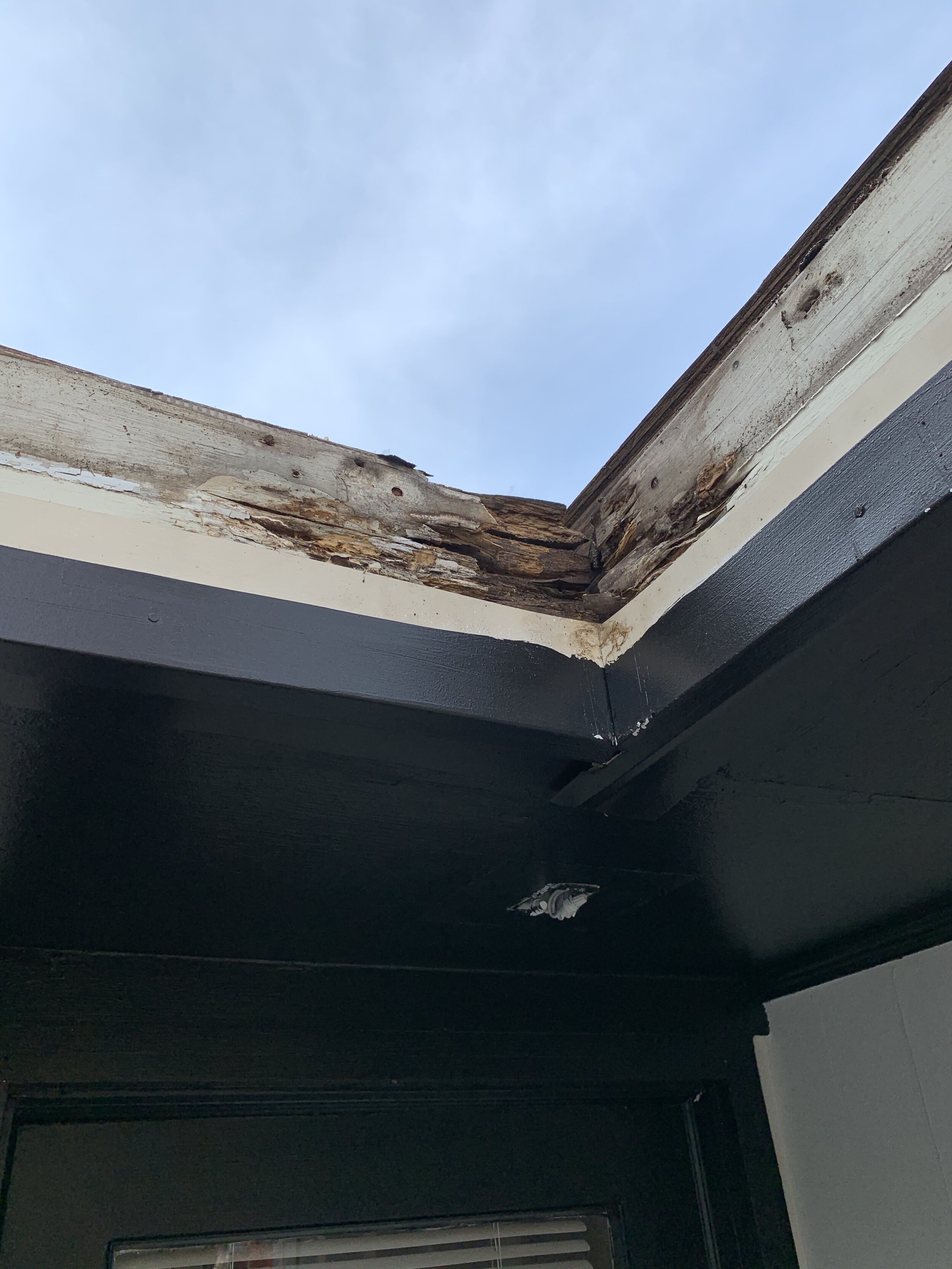
In no time the old roof is off and big changes are happening fast. I wanted to make sure there was no rot underneath the old roof since there were 2 layers of roof on the home. This is the cheap fix when homeowners are looking to replace a roof and is NOT recommended. This adds a lot of weight to the home and can lead to future water damage. As a builder, water is my biggest enemy and I am always looking to make sure I stop it from entering a home. The new roof will be a GAF 50 year Timberline in charcoal. The black roof will really pop with home being painted white now. Ice and water shield will be added to all the edges. This is where moisture always builds up and normally has damage. I knew I was going to find some rot and you will see from the picture below the facia that needed to be changed out. This was just one area of the home, but there were a couple that also looked liked this. A new felt buster will also be added along with re-flashing of the chimney. I got rid of the exhaust fan in the attic since it did really nothing and installed a GAF cobra ridge vent along the entire main roof line. Always make sure your attic area is properly vented with a ridge vent, gable vents, and eave vents. You need to have the proper circulation of air inside your roof and eaves so no future rot will start in the attic.

New 3 1/2” ridge vent is cut in on the main roof line.

New 3 1/2” ridge vent is cut in on the main roof line.

The roof is off and the plywood is in great shape underneath. Very few pieces needed to be changed out.

The roof is off and the plywood is in great shape underneath. Very few pieces needed to be changed out.

This area is a pitch point that runs into the old gutter. You can see that the water was getting behind the gutter and running down the facia.

This area is a pitch point that runs into the old gutter. You can see that the water was getting behind the gutter and running down the facia.

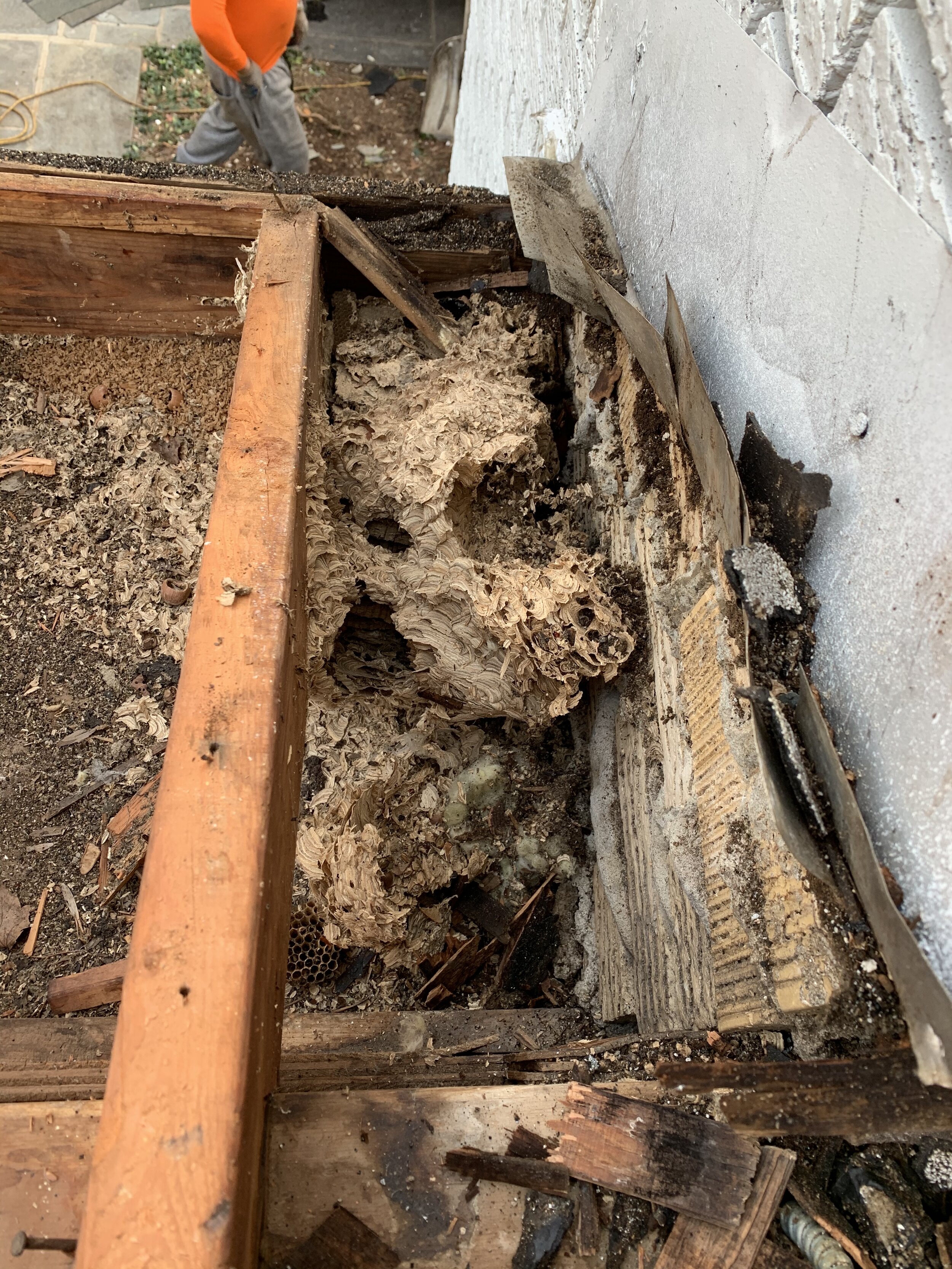
One large surprise that I found was a huge wasp nest that was in one of the eaves. This must have been there for a long time and as I took off a little more of the eave I found another 5 nests!!!!! This is just one of the unforeseen problems that arise in a renovation and have to be handled immediately when they are found.


Look at the size of this nest!

Look at the size of this nest!

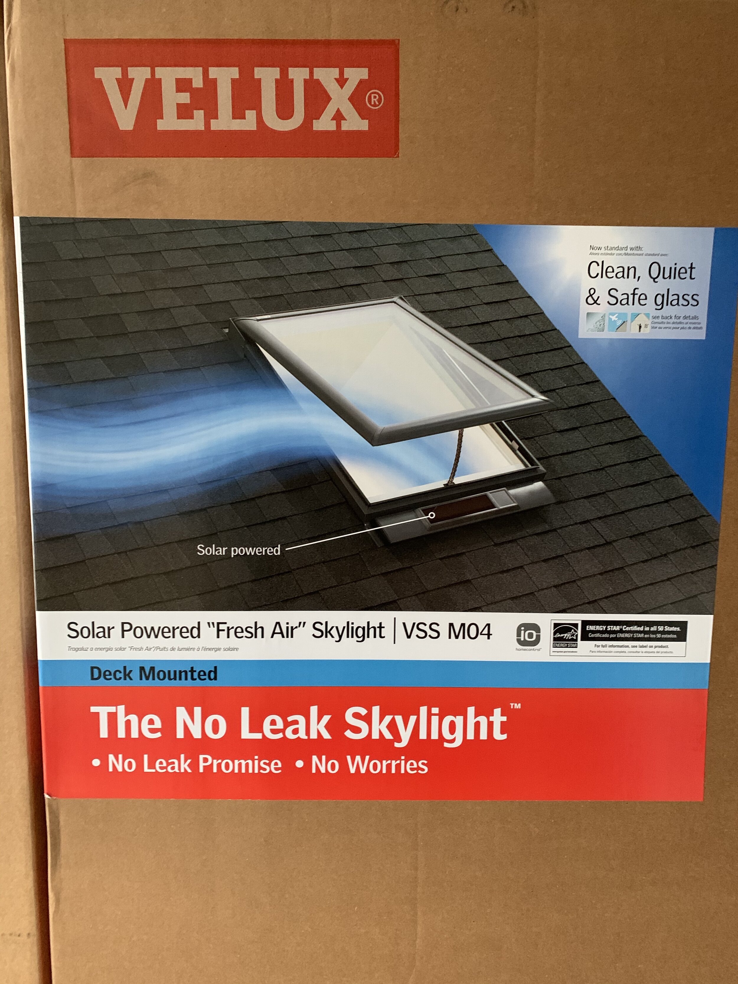
Next it’s time to put in the new skylights!!! I chose the solar powered “Fresh Air” Skylight VSS M04 in the deck mounted model. Since this model is solar powered it has greater energy efficiency, greater functionality, and can open to bring in fresh air along with solar powered blinds and a rain sensor that closes the skylight at the first sign of rain. This skylight is not like your normal skylight that is fixed to just bring in light. I can circulate air throughout the home with the ease of opening it with a remote and if the light is to much I can close the blinds to give some more privacy. I cannot tell you how excited I am to get these installed and see how much natural light will flood into the space! My mudroom is almost like a sun-room now with amount of light that I have coming in. To see more about the Fresh Air Skylights.

Solar Powered “Fresh Air” Skylight VSS M04

Solar Powered “Fresh Air” Skylight VSS M04

Skylights are in and look incredible.

Skylights are in and look incredible.

4 different spaces now become 1 with the walls down and shared light.

4 different spaces now become 1 with the walls down and shared light.

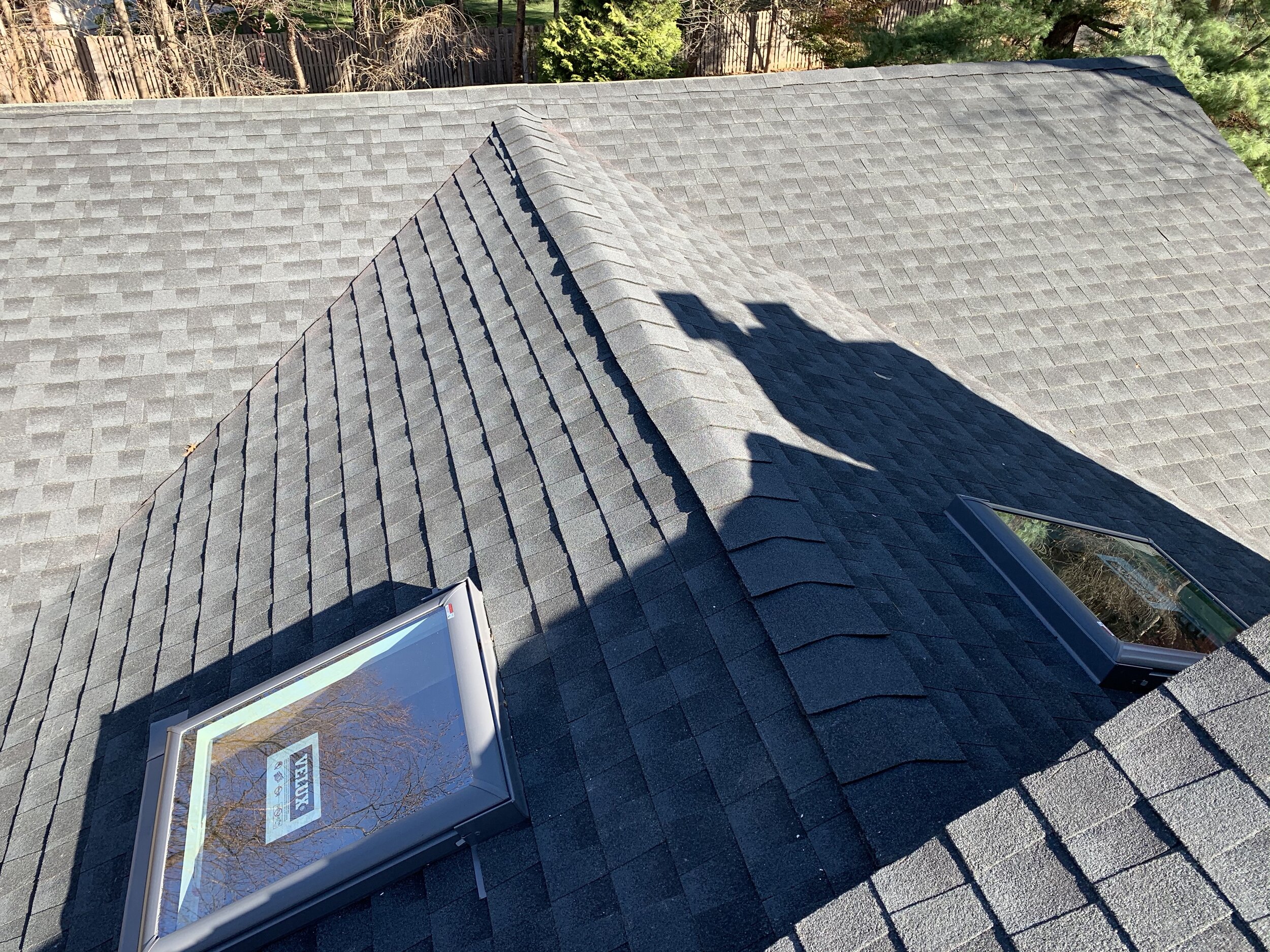
Both of the skylights are installed and the light that comes through them lights up the entire home. I can walk through this home and literally have no lights on throughout the entire day saving on a lot of energy. The light from the mudroom area is shared with the living room, dining room, and kitchen. This simple install has literally changed the dynamic of the rest of the home and is making a huge difference in my quest to share light throughout the home. It is crucial that you also find the right installer when putting these in to make sure they are done correctly. For additional information and to find an installer near you.

Two new skylights are in with new roof.

Two new skylights are in with new roof.

New roof is on

New roof is on

The new roof and skylights are complete and my home is completely transformed. Some of the most basic items during a renovation can have such a huge impact. If you are changing out the roof or doing a renovation look for areas that you can install a skylight. The added benefits are going to transform your home and give you the light that you desperately need. Velux has a variety of models and sizes to choose from so check out their website and see what is the right fit for you.

See more here from Velux.